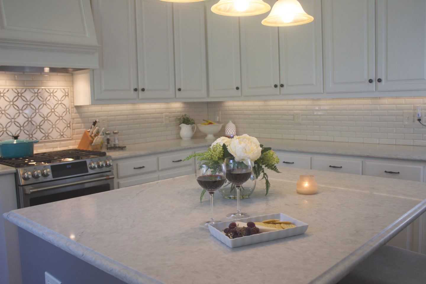
I am in awe that I am typing this post and just so excited to share it with you this morning. While updating our kitchen has been something we have wanted to do since we first purchased our home over three years ago, there have been a lot of times where I thought it might never happen. Life gets in the way of these grand plans sometimes and money gets spent on less glamorous things such as car and irrigation system repairs.
I can hardly believe that this beautiful room is really my kitchen and I couldn’t be happier with how it turned out. The new space has made little tasks like cooking dinner, unloading the dishwasher, and wiping down the countertops so much more fun.
Now, before I show you the finished product, I think its only appropriate to start this post with a few obligatory before photos. These are from the initial listing of our house and the only things we had done were paint the walls and swap out that island light fixture.
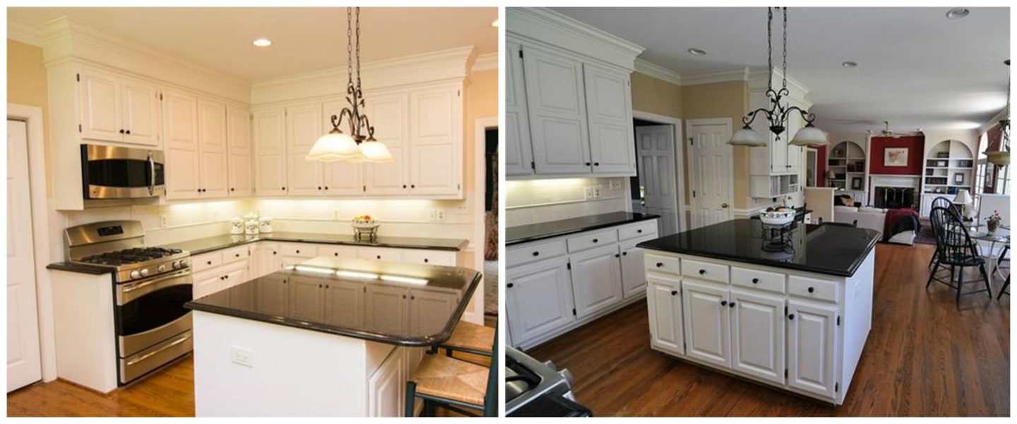
It was certainly not a terrible kitchen by any means – just a little dated and not really my style. I loved the character of the space but I desperately wanted to lighten it up and make it more functional for our family.
So, here we go! Let’s take a look at this space after six weeks of refreshing.
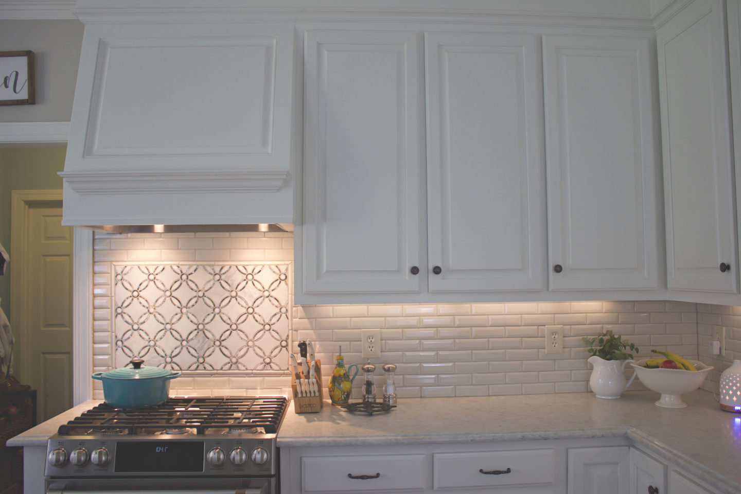
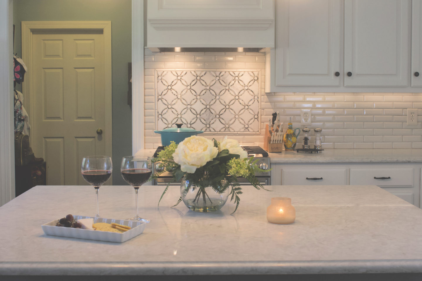
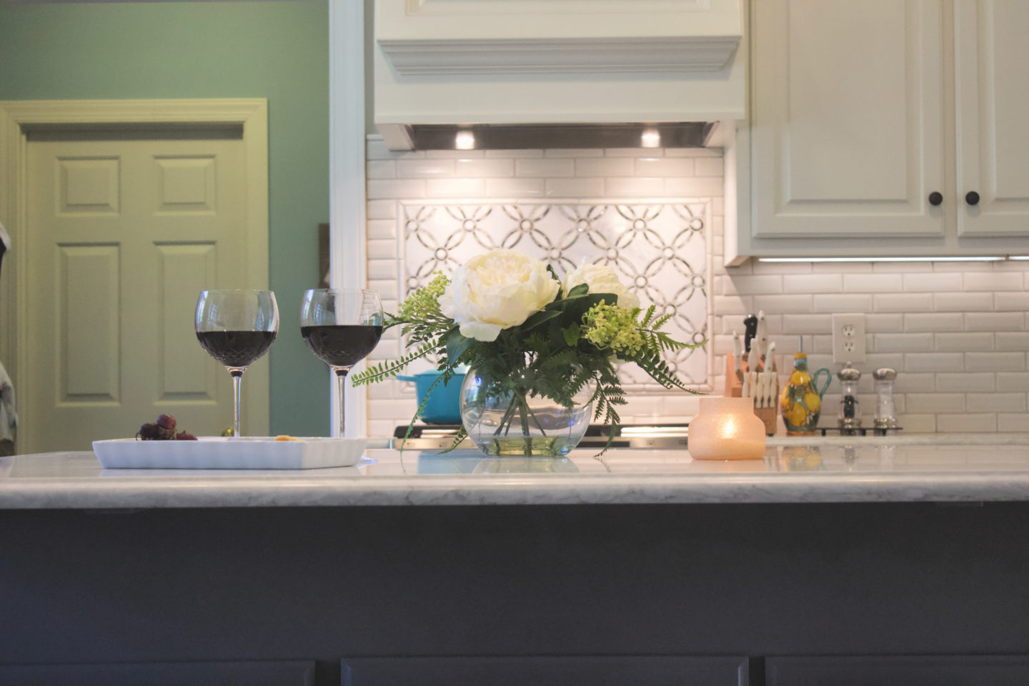
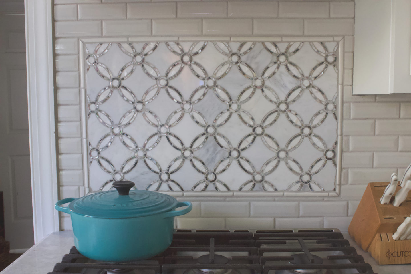
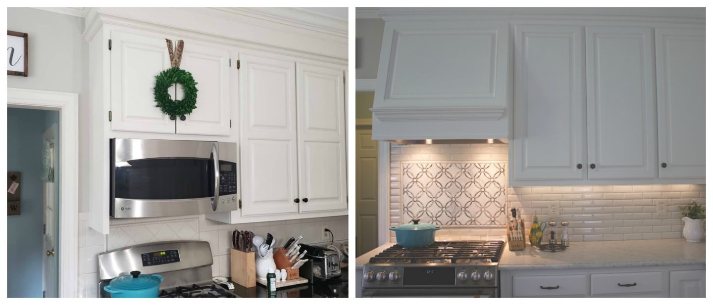
The range right by the door is kind of an awkward layout but it is the center of the space so I really wanted it to become more of a feature, aesthetically. I think we really hit the nail on the head here by swapping our old over the range microwave out for a range hood, switching our range to a slide in, and then adding the beautiful marble and mother of pearl tile insert.
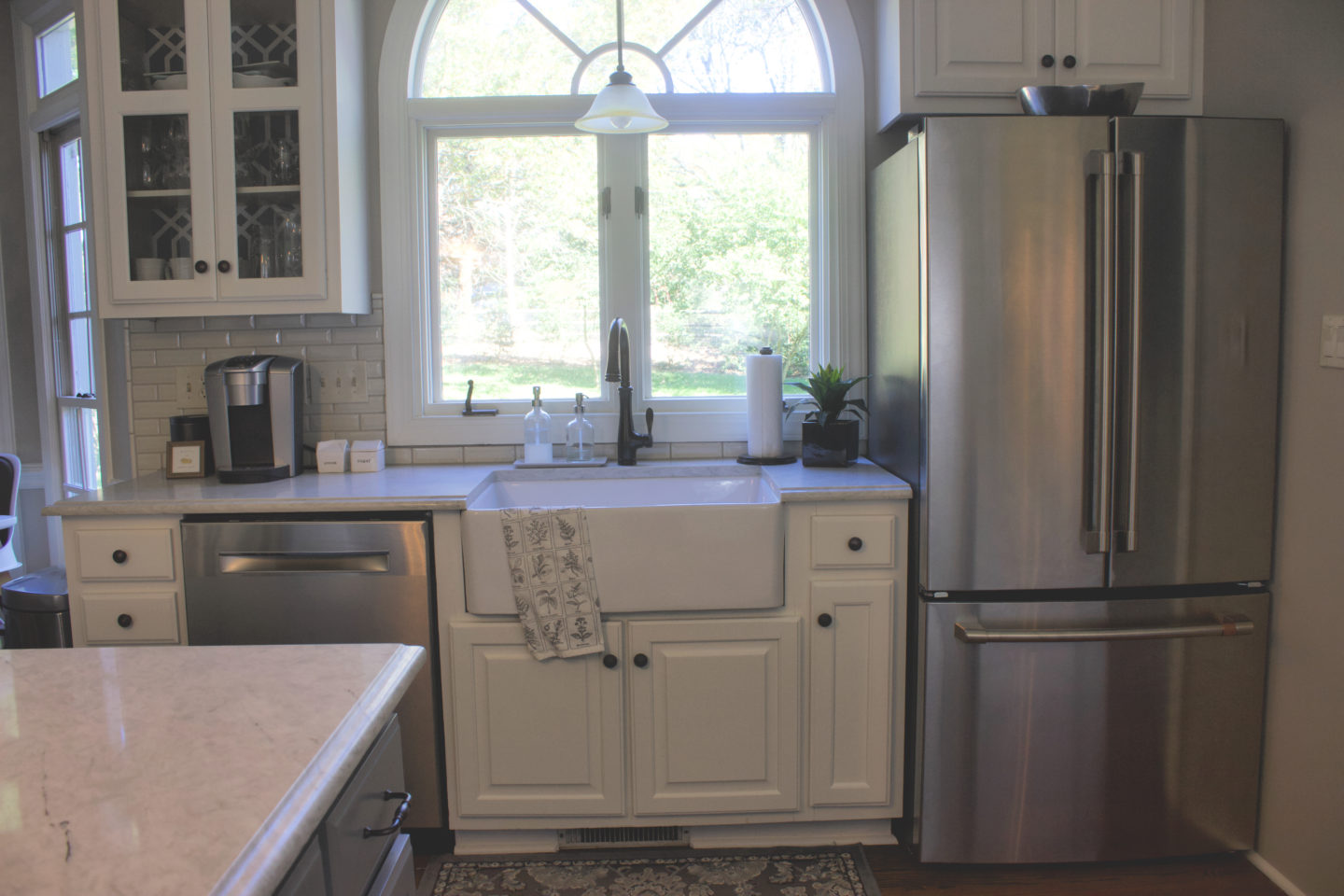
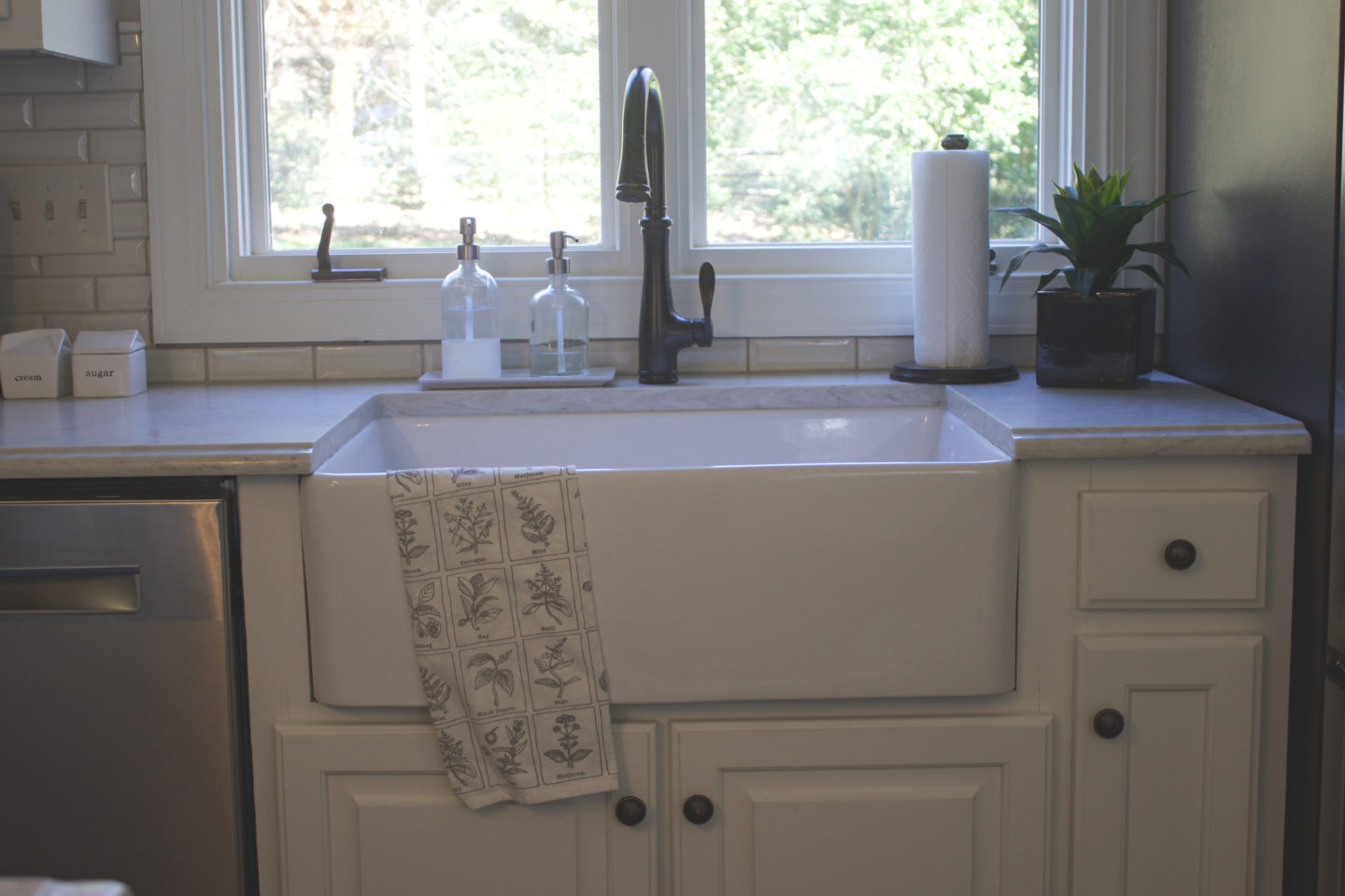
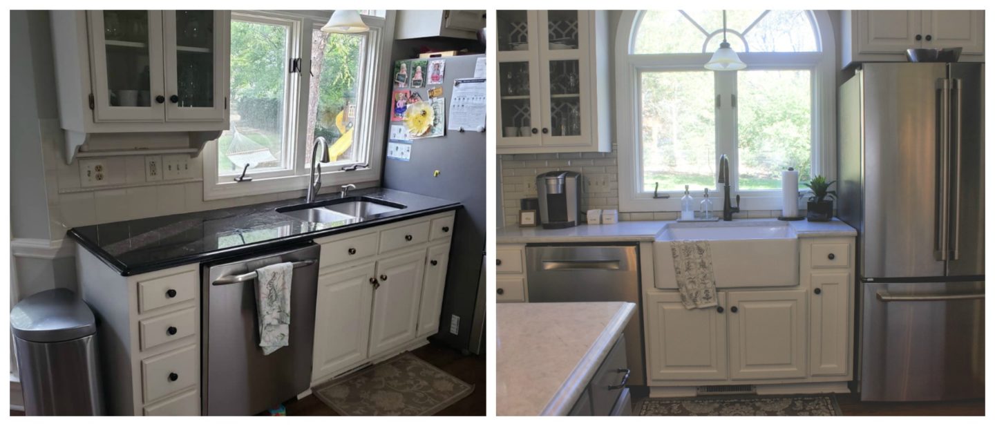
I am also just loving our new farmhouse sink. I think it is beautiful but so much more practical for me as well. Being able to soak a full baking sheet makes me all kinds of happy. I love functionality! We ended up having to replace our refrigerator when our old one died unexpectedly in the midst of this project. I don’t love unexpected expenses but I do love our new fridge. We went with the counter depth Cafe with internal ice and water dispenser and I think it looks so much more streamlined, especially paired with the pocket handle on our new dishwasher. I really love that there are no buttons on the outside.
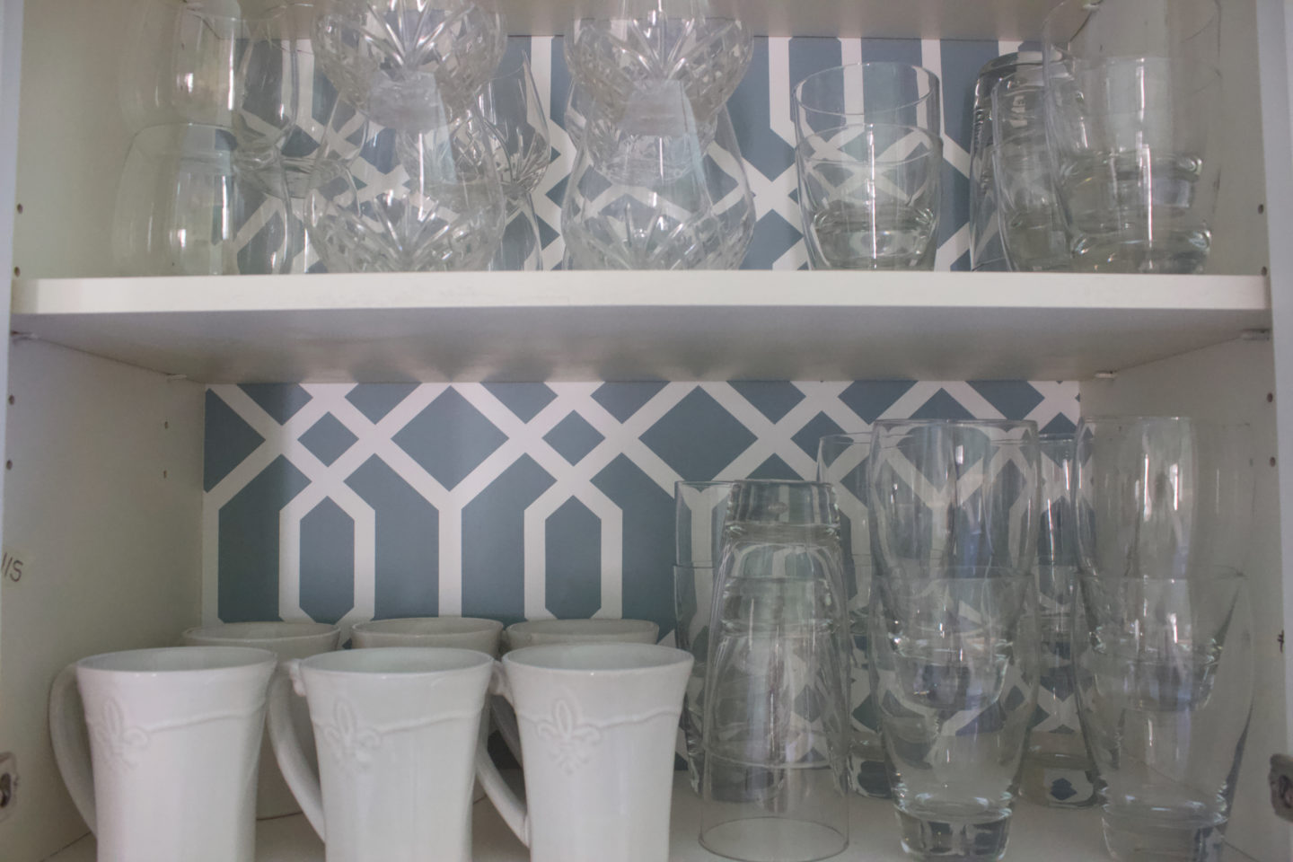
We only replaced the upper cabinet doors but I feel like by adding a fresh coat of paint and replacing our old exterior hinges with soft-close hidden hinges, it has really modernized the look of them without the investment of new cabinetry.
The peel and stick wallpaper in the back of this cabinet is so fun and I love the pop of color it adds. The color is the exact same shade of blue as the accent wall in our living room, which our kitchen opens up into so I just love how this ties everything together without being too much color for the light, bright kitchen I had been dreaming of.
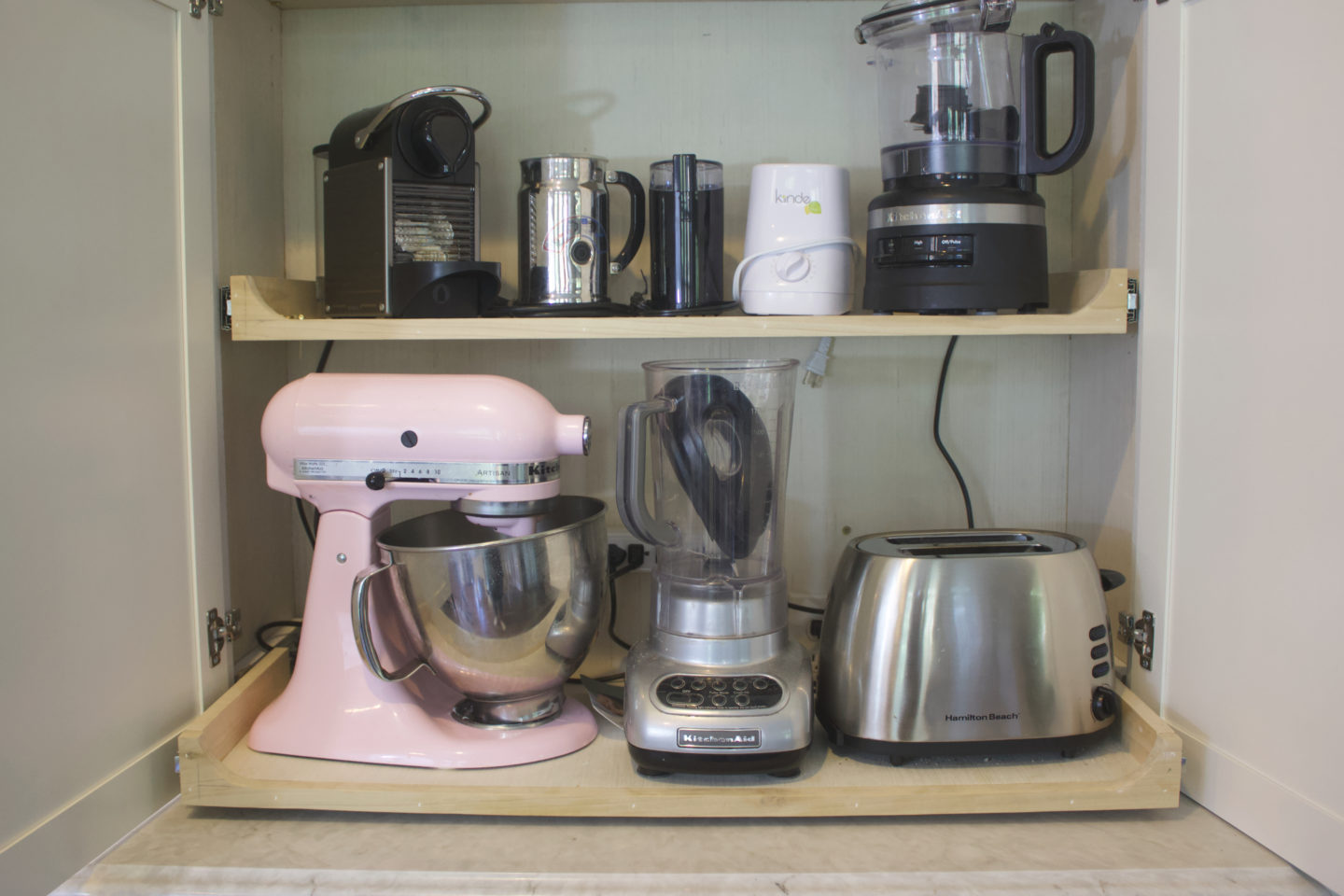
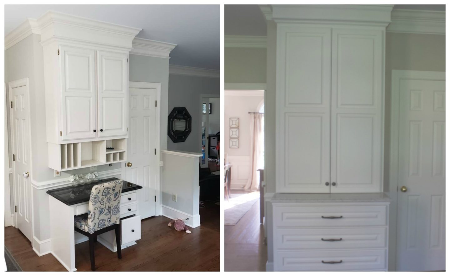
Our new countertops are so much easier to clean and they really make a world of difference in making the space feel light. Of course the biggest change by far was swapping out our old built in desk for an appliance garage. Our carpenter custom-built it for us to preserve our hardwood floors and crown molding so neither of those had to be replaced or modified. It now holds all the small appliances that previously cluttered my countertop, allowing them to stay plugged in and ready to use, while hiding behind closed doors when they’re not needed.
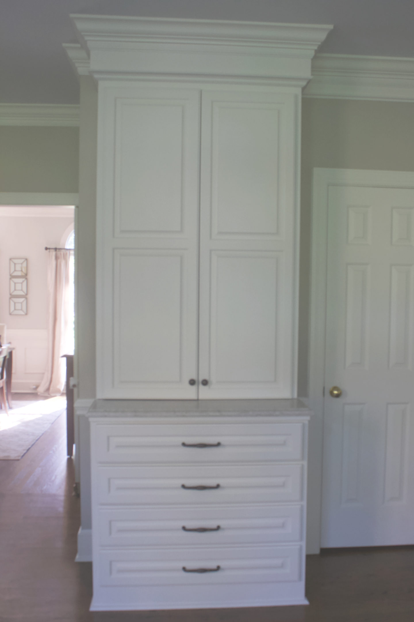
I’m also using that top drawer for various chargers, pens, post it notes, stamps, and to sort mail. These are the things that used to clutter the top of my desk but now they are hidden out of sight.
I couldn’t be happier with how this project turned out. Thank you for following along with me over the past six weeks and thank you to the One Room Challenge and Better Homes and Gardens for allowing me to share this project. Find the other reveals today here.
Sources:
- Quartz countertops – Carrara Caldia by MSI Surfaces
- Backsplash – Accent tile from The Tile Shop, subway tile beveled antique white 2 x 6 by MSI
- Appliances – Cafe Appliances by GE (range and refrigerator), Bosch (dishwasher), Zephyr (range hood insert)
- Paint – Benjamin Moore Revere Pewter (walls), BM White Dove (cabinets), BM Chelsea Gray (island)
- Farmhouse sink – Wayfair
- Wallpaper – Wallpops via Amazon
- Hardware – Wayfair Basics

In case you missed my week-by-week posts along the way, you can find those here:
- Week 1: Inspiration + Before Photos
- Week 2: Demo + Cabinetry Updates
- Week 3: Appliances + Hardware
- Week 4: Countertops + Backsplash
- Week 5: New Doors + Painting Prep
And of course, a big thank you to Castleguard Services, Cardinal Pro Painters, Queen City Home Store, the Tile Shop, and MSI surfaces for all fo their help. Tackling this kind of project own our own (as opposed to doing a Reno with a general contractor) wasn’t easy and was quite the learning experience for me, but I am so thankful for these great professionals who helped every aspect of the project come together. Let’s end with just a few more before and after shots.






I bet you are so thrilled to have this project complete!! It looks beautiful. You made some great choices. I especially love that sink!! It’s gorgeous!
How very beautiful! So fresh, modern and clean. Well done!
What a beautiful kitchen! I hope you love it for a long time!
Oh my goodness I adore this!!